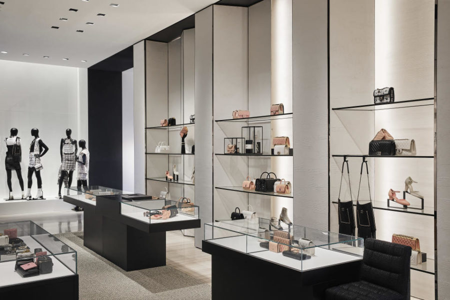
The Chanel store is a refined art piece in its own right — a pure, cool, cube outside and a warm light-filled oasis inside.
The following written content by Lisa Lockwood

“Every single store [in the Miami Design District] is trying to outdo the other with more and more ‘playful’ and elaborate forms of expression. I find them all over the top,” said Peter Marino, the New York-based architect who designed the new Chanel store in the bustling neighborhood, which opens today. “In this context, I’m trying to make the Chanel building stand out with an old simplicity that will offer quite a relief.”
Located in the heart of the district at 155 NE 41st Street, the new boutique feeds off the area’s mix of design and culture. The store aims to be an art piece in its own right — a pure, cool, cube outside and a warm light-filled oasis inside. The two-floor, 7,600-square foot boutique showcases the house’s ready-to-wear, handbags, shoes, eyewear, fine jewelry and watches.
“It’s a beautiful white cube; very, very elegant with very simple windows,” said Marino, who has designed over 200 stores for Chanel, including in Miami.
“Trying to get a building built during coronavirus, it’s really heroic and hard and stressful” said Marino, who started the project at the beginning of COVID-19. “These times are not fun to build it.” Even if it wasn’t completely done — which fortunately it is — “you can’t miss this incredible December season,” he said.
Marino said the way he hoped to wow people in the Design District was the “old architect’s trick.”
“Give them a really tall ceiling, and they’ll all lie down. And that’s what I did. It’s an extraordinary tall volume with the staircase that makes it stand out,” he said. He noted that the windows on the facade are like paintings.
The building’s white stucco facade balances out the bright sunlight along the main pedestrian plaza. Several large, irregularly placed, clear glass windows press inward at an angle to accentuate the mass and depth of the building. The entry has a beveled black steel frame that draws clients into the store. Inside, a low-lying gallery of gray wave stone floors and white hand-plastered walls is lined with the house’s new handbags, including the 11.12, interpreted in different ways each season, such as metallized gold or silver.
A few stone steps lead into a 30-foot tall central atrium topped by a 120-square-foot skylight. The white double-height space provides light and energy and creates a central court inspired by gatherings at Miami’s annual Art Basel. It was designed to be an event space. Read more from WWD.


