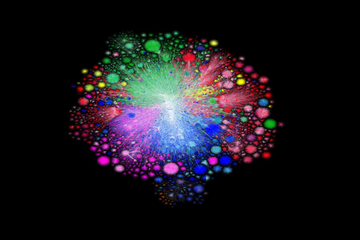
In 2003, Barrett Lyon created a map of the internet. In 2021, he did it again—and showed just how quickly it’s expanded.
Present day, from Opte The Internet: 1997 – 2021. VIDEO: BARRETT LYON/THE OPTE PROJECT
The following written content by Lily Hay Newman
IN NOVEMBER 2003, security researcher Barrett Lyon was finishing college at California State University, Sacramento, while working full time as a penetration tester—a hacker companies hire to find weaknesses in their own digital systems. At the beginning of each job, Lyon would do some basic reconnaissance of the customer’s infrastructure: “case the joint,” as he puts it. He realized he was essentially refining and repeating a formula to map what the new target network looked like. “That formula ended up being an easy piece of software to write, so I just started having this software do all the work for me,” Lyon says.
At lunch with his colleagues one day, Lyon suggested that he could use his network mapper to sketch the entire internet. “They thought that was pretty funny, so they bet me 50 bucks I couldn’t do it,” he says. So he did.
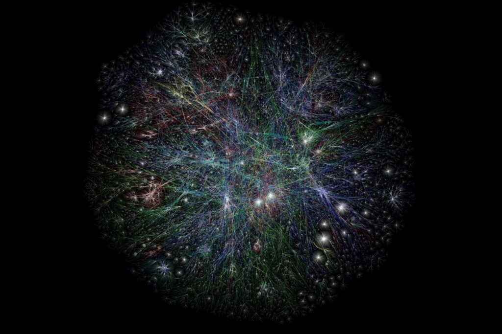
What followed was a vast, celestial jumble of thin, overlapping lines, starbursts, and branches in a static image that depicted the global internet of the early 2000s. Lyon called the piece Opte, and while his betting colleagues were skeptical of the visual rats nests he produced at first, the final product immediately started attracting fans on Slashdot and beyond.
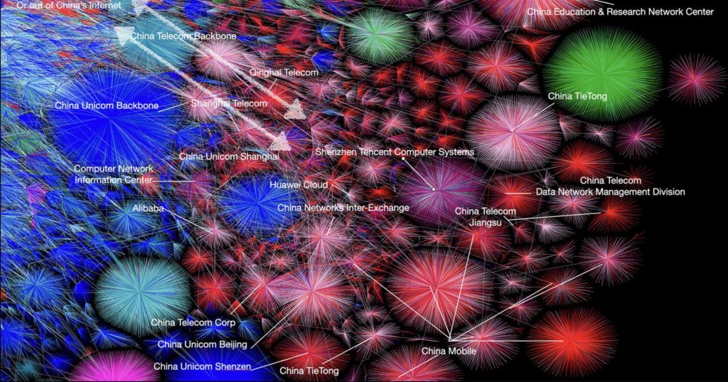
Now Opte is back in an entirely new and updated form. The original version used “traceroutes,” diagnostic commands that scout different paths through a network, to visualize the internet in all of its enormous complexity. But traceroutes can be blocked, spoofed, or have other inaccuracies. So in a 2010 exhibit of the original Opte at the Museum of Modern Art in New York, Lyon explored an alternative. Instead of basing the map on traceroutes, Lyon used Border Gateway Protocol routing tables, the subway maps of the internet, to get a more accurate view. Now he’s carried that approach into this next generation. Read more from WIRED.